Convoy District
Company
The Convoy District is the geographic area in the City of San Diego. The Convoy District has established itself as the commercial and cultural heart for San Diego’s 450,000+ member Asian & Pacific Islander communities.
Role
UX Designer
Tools
Figma
Miro
Skills
Stakeholder Interviews, Heuristic Evaluation, Survey, User Interviews, Site Map, Low-Fidelity Wireframes, Production Website
Duration
Q1 2021
Problem
Despite the growing popularity of the Convoy District in the past 10 years, COVID-19 and anti-Asian racism have presented challenges for businesses in the area. The website has not been updated since 2015 and needs a revamp/redesign, the website is not widely used or known
Context
Solution
To support the Convoy District and to better understand the lack of traction on the website, I facilitated generative research, evaluative research, and created various prototypes. I use the data I collected from research to inform design solutions.
How might we
help businesses in the San Diego Convoy District increase business and revenue?
RESEARCH
Stakeholder Interviews
I met with the Events and Outreach Specialist and the Social Media Specialist from the Convoy District Partnership to better understand their hopes and goals for the website.
1 —
Business Support
They hope to use the website as a resource both to share with small businesses and a marketing tool to share with potential customers of small businesses.
2 —
Community Trust
They have gotten feedback that their website isn't helpful or credible. They are hoping to build trust between users and the Convoy District partnership.
3 —
Event Attendance
Their events have been getting low attendance. They also don't have a central place to track past and upcoming events. They want something easy to update.
“Community. That's what I want people to think about when they hear about the Convoy District partnership.”
Events and Outreach Specialist
RESEARCH
Heuristic Evaluation
Will the user try and achieve the right outcome?
Will the user notice that the correct action is available to them?
Will the user associate the correct action with the outcome they expect to achieve?
If the correct action is performed; will the user see that progress is being made toward their intended outcome?
To identify potential areas for improvement, I spent some time going through some general workflows on the website to identify major issues. I facilitated my heuristic evaluation around the following questions:
1 -
Missing Call-to-Action
There is no clear entry point. It is unclear where users should start upon entering the website. There is no “call to action” upon entering the website.
2 -
Confusing Navigation
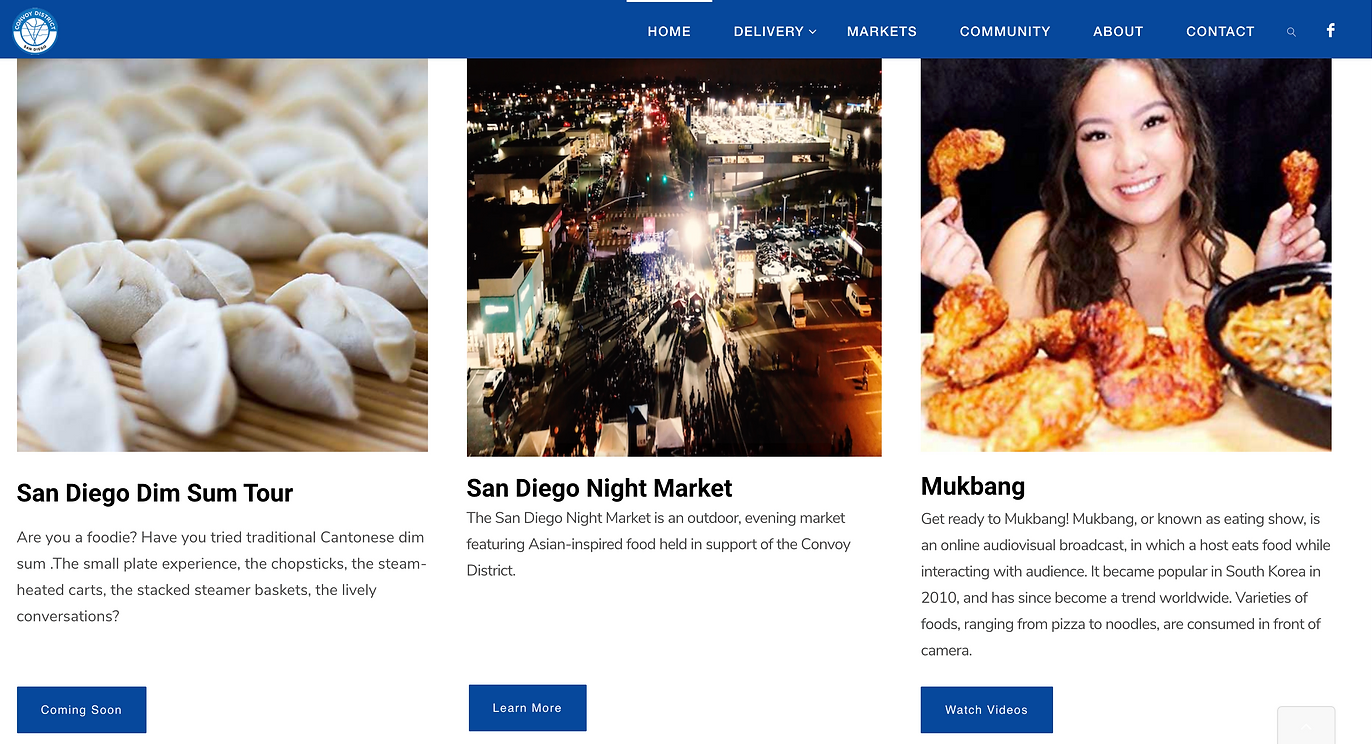
The navigation bar options are not intuitive for the users. “Delivery,” “Markets,” and “Community” do not elicit action from users.
3 -
Unclear Button Hierarchy
Screen elements are not appropriately sized for their intended use. On the home page, all of the links are of equal weight: they are all blue boxes with white text.
RESEARCH
Survey
I created and distributed a survey to better understand: how people feel about Convoy District, their feelings about the website, and their understanding of the Convoy District Partnership. The survey was distributed through the Convoy District Instagram and the Convoy District Newsletter. The survey was open for one week and garnered 45 responses.
The majority of the respondents have lived in San Diego for 4+ years, with 2 respondents living in San Diego for 1-3 years.
1 —
What's new?
Several respondents shared that they have a hard time keeping track of all the new businesses in Convoy District. Many asked for a list of new places.
2 —
What’s the order?
Survey respondents shared that the website was difficult to navigate. Items were not in alphabetical order & only a few restaurants were featured.
3 —
What’s going on?
Respondents shared they do not know where to find information about events. Individual organizations are advertisements are typically how they hear about events.
RESEARCH
User Interviews
I followed up with three survey respondents and facilitated three user interviews to better understand their experiences with the Convoy District and the website. I asked the following questions to better understand both their experience with the site:
What are you thinking as you look at this?
What is your (first) impression of this website?
What do you think this product/feature does or will do?
Where do you start?
When and where do you think someone would use this website?
What do you expect to gain from using this website?
What would keep you from using this website?
Do you feel this website is similar to another one?
Do you trust this website?
All three people interviewed identified as Asian American. The users are a college student born in San Diego, a young adult in their mid-20s working in San Diego, and a parent raising their children in San Diego.
1 —
Tool for Visitors
The three users all shared that they would share the website with their family or friends who are visiting, or people who just moved to San Diego, like college students.
2 —
Community-Building
All users shared that the Convoy District is a place for community building: whether over food, shopping, or events. They want to keep track of what is happening.
3 —
History of Convoy
Respondents shared they also want to learn more about the history of Convoy and Asian Americans in San Diego. They are interested in the growth and change over time.
“Convoy has changed a lot since I was a kid. It is a very hip place now and it is really a hub for Asian food.”
San Diego Resident, Born & Raised
RESEARCH
Mobile Sitemap
Using the data I gathered above, I created the mobile site map for the website to address the needs of users: Home Page (through logo), and the following nav bar with their respective drop-down menus: Eat, Shop, Community, and About.
DESIGN
Design Solutions
Based on the identified pain points collected from the research, I proposed the following design solutions to our team in an effort to support increasing community building for community members and revenue for the businesses.
1 —
Revisit Navigation Bar
Problem: Users have a hard time using the navigation bar.
I recreated the navigation bar and aggregated some of the existing options as well as created drop-down menus.
2 —
Clear Call-to-Action
Problem: There is no place for users to keep updated on events.
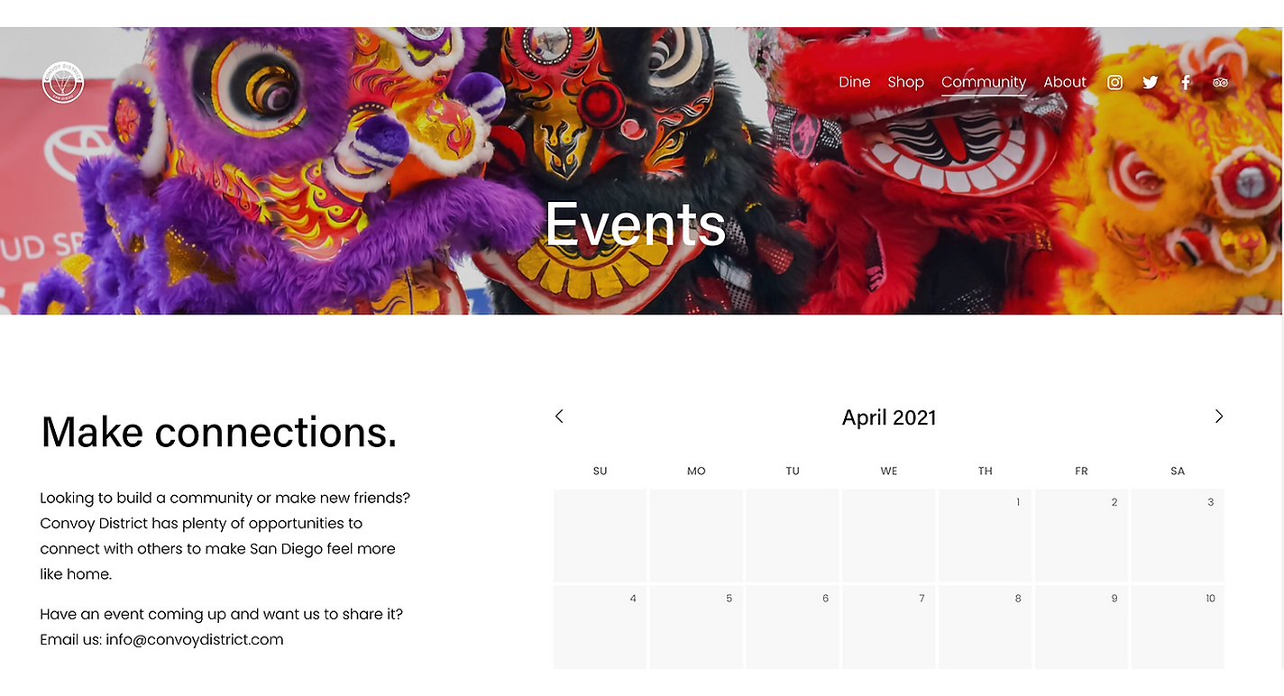
I added a page that includes a calendar where a list of events can be found. I also included the Convoy District email in case small businesses want their events featured on the page.
3 —
Add Event List
Problem: There is no place for users to keep updated on events.
I added a page that includes a calendar where a list of events can be found. I also included the Convoy District email in case small businesses want their events featured on the page.
4 —
Add Desserts & Boba Page
Problem: Drinks and food were together which made it hard for users to navigate.
Under "Dine," I created a drop-down menu, which includes a page for Desserts & Boba as well as a page for Drinks & Happy Hour.
5 —
Add Form for Businesses
Problem: Business owners had no process to get their business added.
To support and build relationships with small business owners, I incorporated a form at the top of each page where small business owners can submit their information. The form asks for name and email, as there will be synchronous follow-up.
6 —
Include Media Features
Problem: The Convoy District Partnership is new and may not seem reputable to users.
To establish trust and build rapport with users, I included a media features page that includes articles and videos from local news stations and newspapers that feature the Convoy District
DESIGN
Deliverable
The UX Designer, Marketing Director, and I met with the WordPress developer to pass on our designs. We were told of the limitations and constraints of our template.
We were not able to do a carousel with images, so we had to reimagine what the top portion would look like.
After further discussion, we decided to remove the maker spaces and Fitness Center West since they would be closed until further notice.
The website went live on August 1. Our changes were shared widely with different HFS units.
DELIVER
Next Steps
Outcomes
The website redesign yielded several positive results for the organization, community, and businesses.
1 —
Increased Site Visits
We launched the website on May 1 to kick off Asian American and Pacific Islander Heritage Month. Throughout the month of May, we saw an increase in site visits both unique and returning.
2 —
Newsletter Subscription Increase
With the website gaining traction, we also saw an increase in people subscribing to the newsletter through the website.
3 —
Business Submissions
We saw an increase in the number of businesses submitting requests to be featured on the website.
Reflections
I learned a lot from this experience about how to incorporate a business's current marketing design system into a website.
Looking back, I wish we did interviews with small businesses and did usability tests before launching. After I created the website, as a team we did a walkthrough but we did not get to test the new website with users.


